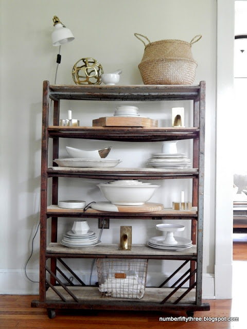
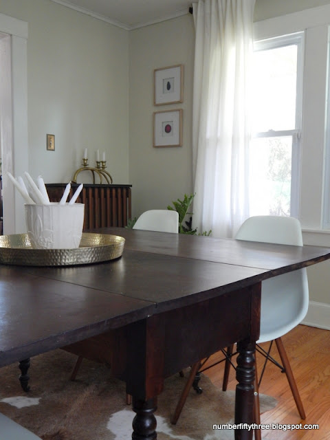
Welcome to our antique with modern inspired dining room!
I shared a quick picture on social media last week, and, while I still have more to do I wanted to document the progress I've made.
A couple of the main problems I've had with decorating this house has been not staying true to the style that I love and overly comparing it to my last house. Just being honest here, sometimes I struggle with liking it here.
So, the table seen in these pictures was from my previous home and dates to the 1830s. It has been at my mom's house since we moved, but over the 4th we went and got it back. It's been the catalyst for this room makeover and has made me so happy. There is not much I love more than antique pieces paired with modern elements, like these chairs Wayfair gifted me for Christmas (similar).
I flip flopped the turquoise cabinet and the antique bakery cart and their new spots suit them far better, size wise.
This cabinet serves as the main jolt of color in the room... And literally the only first floor storage in this old farmhouse!
We picked up this Elephant Ear plant at the grocery store, of all places, for $10 and it fits perfectly in this pot that I've had for a while.
Also, I moved in our hide rug from the living room. It lays so much flatter here and seems like it was meant for the space. I've never done a rug in a dining room before, but felt the table needed to be grounded.
I kept the décor very simple. As time passes I love the uncluttered, neutral look more and more.
So, I do have a few things on my list that I would like to complete in here still. Last year we removed one radiator and I would like to build a cover for the remaining one. I think its in a very awkward spot and adding a cover will give it more of a built in furniture feel. Secondly, above the mantel has been bugging me quite a bit. I feel it needs some additional treatment for depth and interest...maybe shiplap. I'd like to add a bench to the table like how I had it in my old dining room. Lastly, I'd like to remove the cage shades on the chandelier and make it more modern with globe lights...inspiration seen here.
For reference...here are some of the pictures from the real estate listing of this room before we purchased it.
What are your thought? I feel like, even though it's not complete it has much more personality and life to it.


No comments:
Post a Comment
Thank you so much for stopping by Number Fifty-Three! I look forward to your comments.